Effects · Text
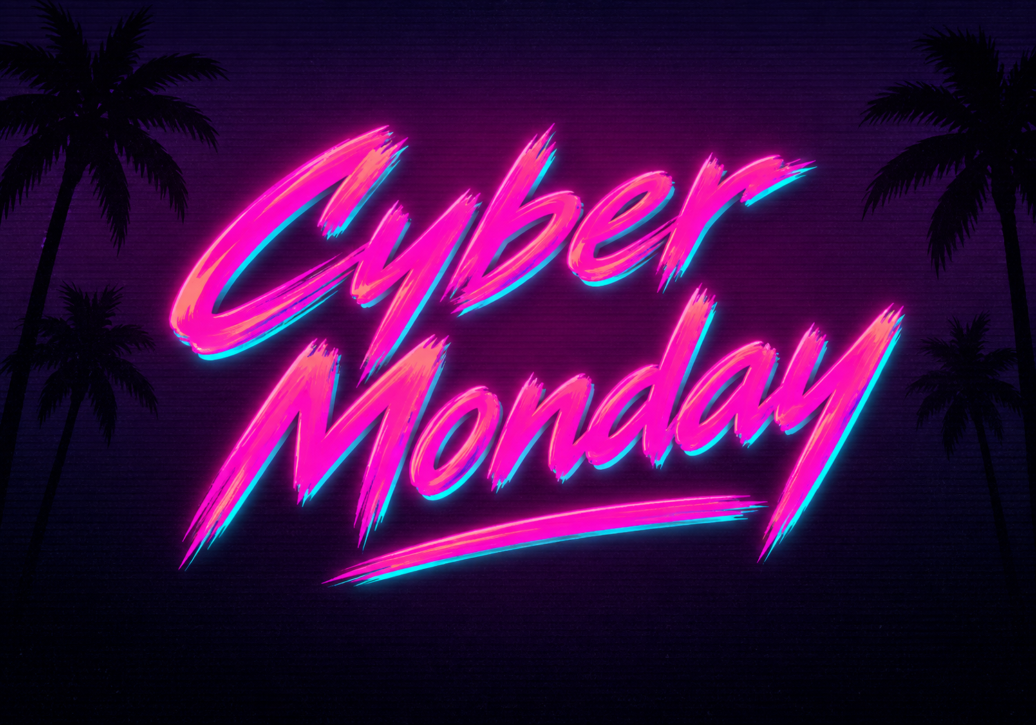
1980s Hot Pink Neon Signature AI Prompt
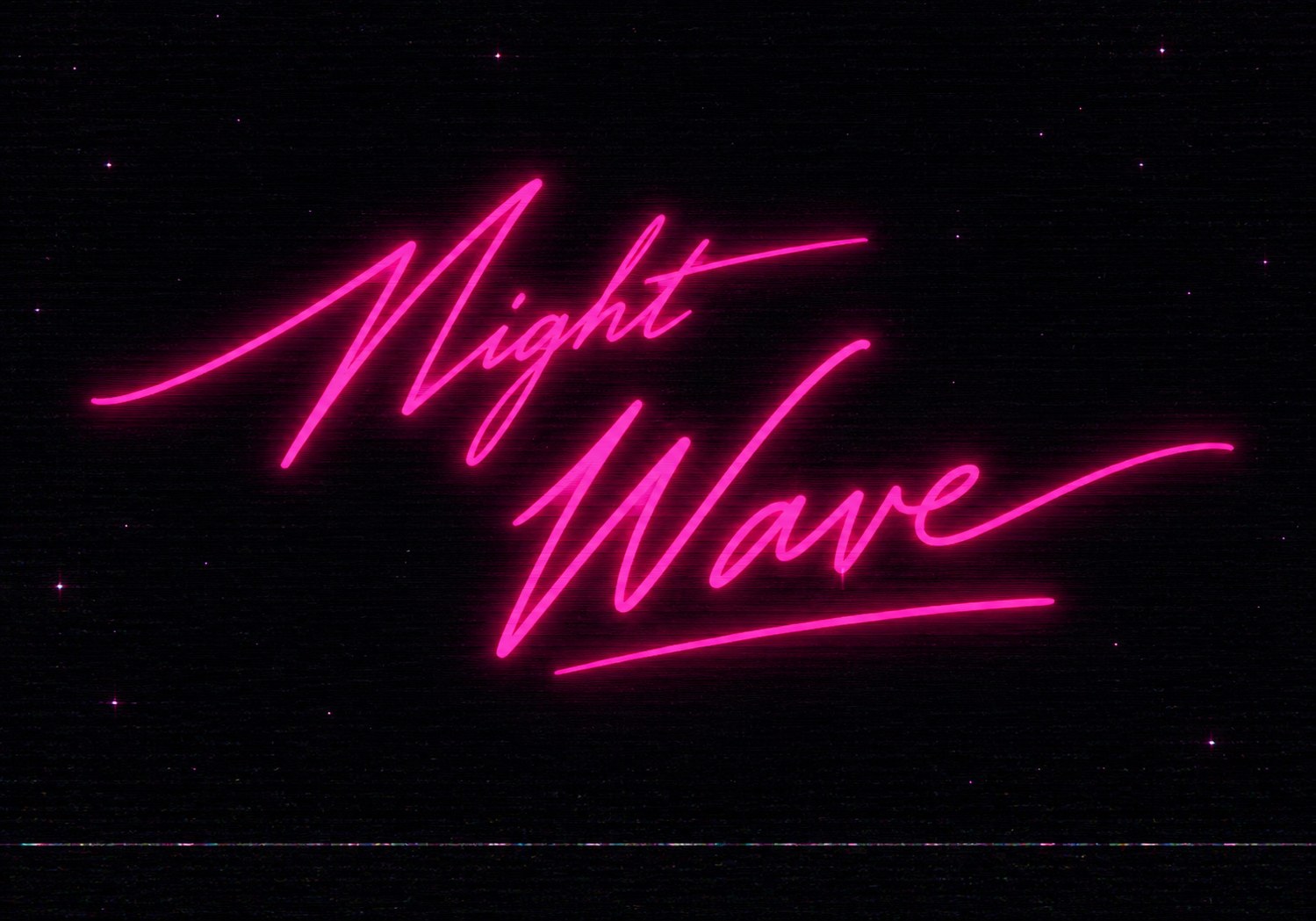
Create elegant late-1980s neon signature AI text efffect with extreme forward slant, tiny lowercase forms, vivid hot-pink glow, starry black background, and subtle VHS texture.
CREATE A COMPLETELY NEW IMAGE FROM SCRATCH. TEXT (verbatim): "Your Text" Render the supplied TEXT exactly once with identical spelling, capitalization, word order, and characters. Do not add captions, dates, symbols, or extra words. CONTINUOUS HANDWRITTEN TYPOGRAPHY — HIGHEST PRIORITY Write the text as original late-1980s human signature calligraphy, not as separate typed letters. Each WORD must be drawn as one continuous flowing main pen stroke from its first letter to its last: every letter's exit stroke visibly and naturally joins the next letter's entry stroke with no gaps. Pen lifts are allowed only between separate words and for essential dots or crossbars. Use slender thin-to-medium monoline calligraphy with an extreme forward italic axis: every capital stem, lowercase stem, loop, connector, ascender, and descender must lean 46–52° to the right, measured away from vertical. Keep all letter axes parallel and consistently slanted. The baseline itself must remain nearly horizontal, rising only 3–6°. Slant the actual letter skeletons; do not rotate, skew, or tilt the complete word or text block as one object. Create narrow loops, smooth rhythmic curves, sharp tapered terminals, tall ascenders, deep descenders, and slight natural pressure variation. Keep the writing elegant, fast, spontaneous, and recognizably handmade while every character remains readable. CAPITAL / LOWERCASE SCALE LOCK Keep each initial CAPITAL letter tall, dramatic, and approximately the same size as in classic signature lettering. Make the lowercase x-height exceptionally small: only 24–30% of the capital height. Lowercase letters must look delicate, compact, and clearly subordinate to their initial capital; lowercase ascenders may reach only 50–60% of the capital height, while descenders may extend elegantly below the baseline. Do not shrink the capitals, enlarge the lowercase letters, or make the word look like uniform-height typography. Preserve all continuous joins with hair-thin connector strokes. Add two or three purposeful long flourishes: one extended entrance stroke, elongated cross-strokes where naturally supported by the letters, and one sweeping terminal exit stroke. These swashes may extend 20–35% beyond their word but must grow organically from the handwriting. They must not become random decorative lines or replace the separate underline. For two to four words, create a compact diagonal two-line signature lockup. Keep the original word order, place the shorter phrase smaller on the upper-left, and make the longest or most important word dominant below. The whole title rises gently from left to right and occupies approximately 68–78% of the canvas width. SEPARATE UNDERLINE — REQUIRED Add exactly ONE thin freestanding underline beneath the final word. It is independent and must never connect to a letter or flourish. Leave a visible gap equal to 8–12% of the average letter height. Match its length to 90–100% of the final word: begin beneath its first letter and end beneath its last, extending no more than 3% beyond either side. Use a shallow upward sweep and fine tapered ends. SATURATED PINK NEON — STRONG GLOW Make the lettering unmistakably vivid saturated HOT PINK / FUCHSIA. Use a solid intense pink luminous core similar to #FF1493 or #FF0A8A—not white, pale pink, red, orange, or coral. Build a clearly stronger two-stage glow: a dense saturated magenta bloom extending about 3–5 stroke widths from the core, plus a broad soft dark-pink aura extending about 10–14 stroke widths into the background. The nearby star field should receive subtle pink illumination. Do not introduce cyan, blue, turquoise, rainbow edges, gradients, multicolor shadows, or metallic reflections. The text must be the brightest and most saturated element. Keep the inner core razor-sharp so the stronger glow never closes counters, hides thin joins, or merges letters. Apply the identical two-stage pink glow to the detached underline. BACKGROUND — FLAT AND STABLE Use a uniform near-black background (#020207) with a barely perceptible midnight-navy tint and only sparse, tiny, sharp pinpoint stars. Keep the entire background flat, still, evenly dark, and low-contrast. No visible nebula clouds, purple fog, gradients, flowing color, waves, streaks, smears, radial light, or spatial distortion. The central area must remain especially clean and empty. Stars must never cross, outline, or compete with the lettering. VHS / OLD CRT EFFECT — TEXTURE ONLY Apply restrained authentic analog-video character strictly as a flat surface overlay: fine straight horizontal scanlines, subtle monochrome noise, soft phosphor bloom, mild tape grain, gentle brightness roll-off, minimal edge color separation, and one thin faint tracking line near the bottom. Keep every scanline perfectly straight and parallel. Do not warp, ripple, stretch, smear, bend, displace, melt, or liquefy the background or lettering. VHS artifacts must never alter the image geometry, break the handwriting, distort spelling, duplicate strokes, or reduce readability. COMPOSITION AND FORMAT — STRICT Exact LANDSCAPE aspect ratio 10:7 (width:height), equivalent to horizontal 5:3.5. Never portrait or square. Position the title slightly above center, reserving space for the detached underline. Keep all lettering, swashes, glow, and underline fully inside the frame with generous margins. Front-facing graphic treatment with no perspective tilt. AVOID Disconnected letters within a word, isolated glyphs, lowercase letters taller than 30% of the capitals, uniform-height lettering, shrunken initial capitals, thick connector strokes, printed handwriting font, block lettering, heavy brush strokes, upright or mildly slanted letters, inconsistent letter angles, rotating the complete word or text block, steep diagonal baseline, rounded bubble letters, thick neon tubes, white neon core, coral or orange color, cyan or blue accents, deep 3D extrusion, underline attached to a letter, underline longer than the final word, multiple underlines, glow that destroys readability, dense bright stars, nebula clouds, purple fog, background gradients, flowing color, warped scanlines, waves, smears, liquid distortion, planets, moon, landscape, palms, city, people, portraits, extra icons, severe glitches, warped or duplicated text, watermark, border, frame, or cropped swashes. Priority: exact horizontal 10:7 format, exact text, extreme consistent 46–52° rightward letterform slant with a nearly horizontal baseline, tall capitals with exceptionally small 24–30% lowercase letters, continuously connected human handwriting, long organic swashes, strong saturated hot-pink glow, a flat undistorted near-black star field, restrained VHS surface texture, and a detached underline matched to the final word.
Free to copy, edit and use in your preferred AI image tool.